IELTS Writing Task 1 - Table (Material, Sample Writing and Exercise)
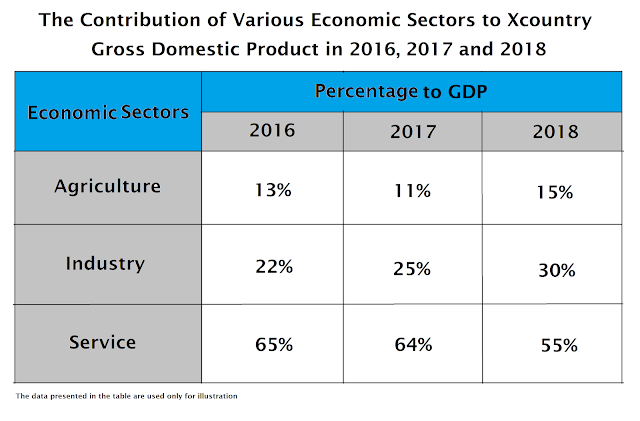
Today, we are going to discuss how a table is described in IELTS Writing Task 1. Previously, we have discussed three other graphs here, here and here. Although the structure of IELTS Writing Task 1 is pretty much the same, we have to always remember that the difficulty level may be different for each graph. For instance, one may find it easier to understand a bar graph, a pie chart and a line graph, but face a lot of challenges trying to describe a table. A table could be too complex too understand and this is one thing that we need to anticipate. For today's discussion, we are going to use a simple table. After learning how a simple table is described, we are going to discuss a more complex table later as an exercise. Take a look at a table below.
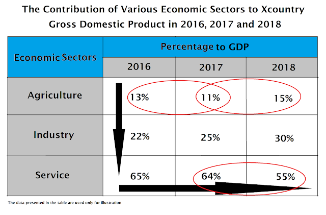
Before we start writing anything, I will try to illustrate how a table could easily be read and how we choose some of the most important components to include in our writing. Take a look at an illustration below.
The first thing that we have to pay attention to is the proportion of primary, secondary and tertiary sectors to Xcountry GDP each year (black arrow pointing downward). Then, we will have to explain how the contribution of each sector changes over years, whether it's increasing or decreasing (the horizontal black arrow). Finally, there are some vital information that we have to include in the writing (red circles).
The general structure of the writing is pretty much the same as that of the other three graphs we have previously discussed.
Now, let's discuss how the table should be described step by step.
Paragraph 1
Introducing the Graph
As usual, the first thing that we have to do is introducing the graph. This is done by paraphrasing the original title. The original title of the table is:
We can paraphrase the original title above so that it becomes like this:
There are three economic sectors presented in the table, which are agriculture, industry and service sector. Units are measured in percentage.
Major trend is a very important component in IELTS Writing Task 1 that helps us arrange our ideas logically and categorize them in two separate paragraphs. From the table above, we know that the contribution of service sector always decreases, while the contribution of industrial sector increases throughout the period. We are going to explain the contributions of these two sectors in paragraph 2. The contribution of agricultural sector went up and down. We are going to explain the contribution of this sector in paragraph 3.
After writing all components above, the whole paragraph 1 will look like this:
The table explains the distribution of Xcountry gross domestic product across economic sectors from 2016 until 2018. There are three economic sectors presented in the table, which are agriculture, industry and service sector. Units are measured in percentage.
Paragraph 2
In paragraph 2, we have to give a very detailed information about the graph, such as the percentage of each economic sector, how the number increased or decreased, which sector had the largest proportion, and so on and so forth.
Proportion
We can see that service sector gives the biggest contribution to GDP. However, the number slightly decreased in 2017, and then witnessed a dramatic fall in 2018. Industrial sector may not be the largest contributor to total GDP, but the number increased quite steadily (it increased by 3% and 5% accordingly). The whole paragraph 2 will look like this:
The graph indicates that service sector experienced constant fall. However, it always became the biggest contributor to GDP, making up 65% in the year 2016 and slightly decrease to 64% in the following year. In 2018, the number significantly decreased by nearly 10%. Unlike service sector, industrial sector witnessed a constant growth. Although it only contributed 22% to total GDP in 2016, the number steadily increased to 25% and 30% respectively.
Paragraph 3
The basic idea of paragraph 3 is the same as the basic idea of paragraph 2. We have to explain that the contribution of agricultural sector to total GDP of Xcountry fluctuated. Making up only 13% in 2016, the number slightly decreased to 11% in 2017. There was a 4% growth in 2018, so agriculture's total contribution to GDP in 2018 was 15%. You may notice that this sector had the least contribution to GDP, even when it reached its highest percentage in 2018. The third paragraph of our writing will look like this:
Agricultural sector gave the least contribution to Xcountry's GDP in 2016, making up only 13%. In the following year, the number even slightly reduced to 11%. Despite the 4% growth in 2018, the contribution was still relatively small compared to the two other sectors which comprised 85% of the total GDP.
The whole writing will look like this:
The table explains the distribution of Xcountry gross domestic product across economic sectors from 2016 until 2018. There are three economic sectors presented in the table, which are agriculture, industry and service sector. Units are measured in percentage.
The graph indicates that service sector experienced constant fall. However, it always became the biggest contributor to GDP, making up 65% in the year 2016 and slightly decrease to 64% in the following year. In 2018, the number significantly decreased by nearly 10%. Unlike service sector, industrial sector witnessed a constant growth. Although it only contributed 22% to total GDP in 2016, the number steadily increased to 25% and 30% respectively.
Agricultural sector gave the least contribution to Xcountry's GDP in 2016, making up only 13%. In the following year, the number even slightly reduced to 11%. Despite the 4% growth in 2018, the contribution was still relatively small compared to the two other sectors which comprised 85% of the total GDP.
Word count: 160
There are several things that I want to point out from the sample writing above.
Task Achievement
First and foremost, I finally manage to write efficiently. The writing has 160 words in it, and the recommended number of words for IELTS Writing Task 1 is 150-190 words. So, problem solved.
Cohesion and Coherence
Other than efficiency, I also try to maximize the score for cohesion and coherence by using several cohesive devices which you can see below:
The table explains the distribution of Xcountry gross domestic product across economic sectors from 2016 until 2018. There are three economic sectors presented in the table, which are agriculture, industry and service sector. Units are measured in percentage.
The graph indicates that service sector experienced constant fall. However, it always became the biggest contributor to GDP, making up 65% in the year 2016 and slightly decrease to 64% in the following year. In 2018, the number significantly decreased by nearly 10%. Unlike service sector, industrial sector witnessed a constant growth. Although it only contributed 22% to total GDP in 2016, the number steadily increased to 25% and 30% respectively.
Agricultural sector gave the least contribution to Xcountry's GDP in 2016, making up only 13%. In the following year, the number even slightly reduced to 11%. Despite the 4% growth in 2018, the contribution was still relatively small compared to the two other sectors which comprised 85% of the total GDP.
Lexical Range and Accuracy
In terms of lexical range and accuracy, you may notice some new words that I tried to use in my writing, such as despite, respectively, steadily, and witnessed. Other than these words, you may also notice the more subtle paraphrasing such as agriculture and agricultural sector, experienced and witnessed, and some other words.
 |
| Table |
Before we start writing anything, I will try to illustrate how a table could easily be read and how we choose some of the most important components to include in our writing. Take a look at an illustration below.
 |
| Table |
The first thing that we have to pay attention to is the proportion of primary, secondary and tertiary sectors to Xcountry GDP each year (black arrow pointing downward). Then, we will have to explain how the contribution of each sector changes over years, whether it's increasing or decreasing (the horizontal black arrow). Finally, there are some vital information that we have to include in the writing (red circles).
The general structure of the writing is pretty much the same as that of the other three graphs we have previously discussed.
Paragraph 1
- Introduction
- Explaining variables
- Explaining major trend
Paragraph 2
- Giving detailed information of major trend 1 (percentage, proportion, lowest/highest, increase/decrease)
Paragraph 3
- Giving detailed information of major trend 2 (percentage, proportion, lowest/highest, increase/decrease)
Now, let's discuss how the table should be described step by step.
Paragraph 1
Introducing the Graph
As usual, the first thing that we have to do is introducing the graph. This is done by paraphrasing the original title. The original title of the table is:
- The contribution of various economic sectors to Xcountry Gross Domestic Product in 2016, 2017 and 2018.
We can paraphrase the original title above so that it becomes like this:
- The table explains the distribution of Xcountry gross domestic product across economic sectors from 2016 until 2018
Explaining Variables
We can see from the table that there are at least three things that we have to explain in our writing. First of all, we have to explain the three economic sectors presented in the graph. We already explained the year in the first sentence so we can skip this information. Lastly, we have to explain that the data is presented in percentage. So, the second and the third sentence of our first paragraph would be like this:
There are three economic sectors presented in the table, which are agriculture, industry and service sector. Units are measured in percentage.
Explaining Major Trends
Major trend is a very important component in IELTS Writing Task 1 that helps us arrange our ideas logically and categorize them in two separate paragraphs. From the table above, we know that the contribution of service sector always decreases, while the contribution of industrial sector increases throughout the period. We are going to explain the contributions of these two sectors in paragraph 2. The contribution of agricultural sector went up and down. We are going to explain the contribution of this sector in paragraph 3.
After writing all components above, the whole paragraph 1 will look like this:
The table explains the distribution of Xcountry gross domestic product across economic sectors from 2016 until 2018. There are three economic sectors presented in the table, which are agriculture, industry and service sector. Units are measured in percentage.
In paragraph 2, we have to give a very detailed information about the graph, such as the percentage of each economic sector, how the number increased or decreased, which sector had the largest proportion, and so on and so forth.
Proportion
We can see that service sector gives the biggest contribution to GDP. However, the number slightly decreased in 2017, and then witnessed a dramatic fall in 2018. Industrial sector may not be the largest contributor to total GDP, but the number increased quite steadily (it increased by 3% and 5% accordingly). The whole paragraph 2 will look like this:
The graph indicates that service sector experienced constant fall. However, it always became the biggest contributor to GDP, making up 65% in the year 2016 and slightly decrease to 64% in the following year. In 2018, the number significantly decreased by nearly 10%. Unlike service sector, industrial sector witnessed a constant growth. Although it only contributed 22% to total GDP in 2016, the number steadily increased to 25% and 30% respectively.
Paragraph 3
The basic idea of paragraph 3 is the same as the basic idea of paragraph 2. We have to explain that the contribution of agricultural sector to total GDP of Xcountry fluctuated. Making up only 13% in 2016, the number slightly decreased to 11% in 2017. There was a 4% growth in 2018, so agriculture's total contribution to GDP in 2018 was 15%. You may notice that this sector had the least contribution to GDP, even when it reached its highest percentage in 2018. The third paragraph of our writing will look like this:
Agricultural sector gave the least contribution to Xcountry's GDP in 2016, making up only 13%. In the following year, the number even slightly reduced to 11%. Despite the 4% growth in 2018, the contribution was still relatively small compared to the two other sectors which comprised 85% of the total GDP.
The whole writing will look like this:
The table explains the distribution of Xcountry gross domestic product across economic sectors from 2016 until 2018. There are three economic sectors presented in the table, which are agriculture, industry and service sector. Units are measured in percentage.
The graph indicates that service sector experienced constant fall. However, it always became the biggest contributor to GDP, making up 65% in the year 2016 and slightly decrease to 64% in the following year. In 2018, the number significantly decreased by nearly 10%. Unlike service sector, industrial sector witnessed a constant growth. Although it only contributed 22% to total GDP in 2016, the number steadily increased to 25% and 30% respectively.
Agricultural sector gave the least contribution to Xcountry's GDP in 2016, making up only 13%. In the following year, the number even slightly reduced to 11%. Despite the 4% growth in 2018, the contribution was still relatively small compared to the two other sectors which comprised 85% of the total GDP.
Word count: 160
There are several things that I want to point out from the sample writing above.
Task Achievement
First and foremost, I finally manage to write efficiently. The writing has 160 words in it, and the recommended number of words for IELTS Writing Task 1 is 150-190 words. So, problem solved.
Cohesion and Coherence
Other than efficiency, I also try to maximize the score for cohesion and coherence by using several cohesive devices which you can see below:
The table explains the distribution of Xcountry gross domestic product across economic sectors from 2016 until 2018. There are three economic sectors presented in the table, which are agriculture, industry and service sector. Units are measured in percentage.
The graph indicates that service sector experienced constant fall. However, it always became the biggest contributor to GDP, making up 65% in the year 2016 and slightly decrease to 64% in the following year. In 2018, the number significantly decreased by nearly 10%. Unlike service sector, industrial sector witnessed a constant growth. Although it only contributed 22% to total GDP in 2016, the number steadily increased to 25% and 30% respectively.
Agricultural sector gave the least contribution to Xcountry's GDP in 2016, making up only 13%. In the following year, the number even slightly reduced to 11%. Despite the 4% growth in 2018, the contribution was still relatively small compared to the two other sectors which comprised 85% of the total GDP.
Lexical Range and Accuracy
In terms of lexical range and accuracy, you may notice some new words that I tried to use in my writing, such as despite, respectively, steadily, and witnessed. Other than these words, you may also notice the more subtle paraphrasing such as agriculture and agricultural sector, experienced and witnessed, and some other words.


Komentar ini telah dihapus oleh pengarang.
BalasHapusMasih belum kapok ya maling konten orang. Tracing tindakan kriminal seperti ini gak susah, apalagi dengan bantuan tim cyber. Sampai berjumpa nanti di meja hijau, saya kabari lagi detailnya misal laporan sudah jadi.
BalasHapus